Club Badges
A Measured Ranking of the 20 Premier League Badges for 2025/26
A practical appraisal of the Premier League crests for 2025/26, from minimalism to celebrated classics.
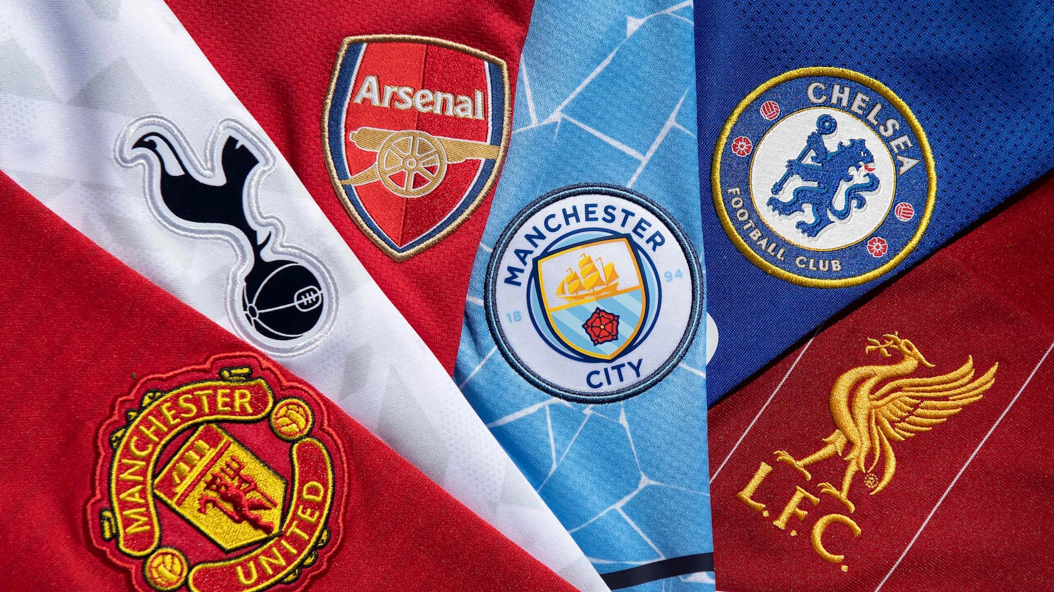
Club badges are more than decoration; they are shorthand for history, local industry, myth and supporter attachment. This piece assesses the 20 Premier League crests in 2025/26, from the spare to the storied.
Some designs favour minimalism. Brighton once embraced “The Dolphins” but moved to a simpler predator motif, a flying shape that dominates a pared-back badge. Fulham’s emblem is essentially initials, and many fans only later realise the red silhouette simply spells out “FFC”. At the other end of the spectrum, a handful of badges lean heavily on historical reference. Aston Villa’s star, reinstated after the 2023–24 redesign didn’t catch on, commemorates the European Cup win in 1982. Nottingham Forest’s return to a 1970s aesthetic feels like a conscious nod to past glory.
Colour and execution matter. Burnley’s 2023 update left the underlying crest unchanged while swapping yellow, gold and black for a purple-and-white palette. Manchester City offered a faithful modernisation of a classic badge, but it also started a wave of imitators. Brentford’s compact, high-contrast crest uses red, white and black with a prominent bee to striking effect.
Some badges register as awkward experiments. Chelsea’s current badge is described here as an attempt to recreate a historical mark, a look that divides opinion and invites talk of further rebranding under Todd Boehly. Wolves and others lean on simplified shapes that risk appearing generic. “If you didn’t use a logo pack on Football Manager from 2009 to 2014, this is what your unlicensed team’s crest looked like.”
Certain designs combine elegance with durability. Tottenham’s thin-line cockerel retains a refined quality even if it scales delicately in graphics. Everton’s post-2013 recovery produced a near-perfect emblem. Leeds uses a balanced shield, blue-and-yellow scheme and a central Yorkshire Rose to good effect. Crystal Palace pairs an imposing eagle with the iconic building, albeit at an unrealistic scale.
Badges can be sentimental as well as practical. Sunderland’s crest offers layered local references and considered composition, while Nottingham Forest and others wear their histories visibly. Across the division, the best crests are those that balance clarity, heritage and a visual identity supporters can rally behind.
Chelsea
Chelsea’s Ten Most Significant Kits, Reappraised
Ranking Chelsea’s ten best shirts, from classic royal blue homes to bold, unconventional away kits.
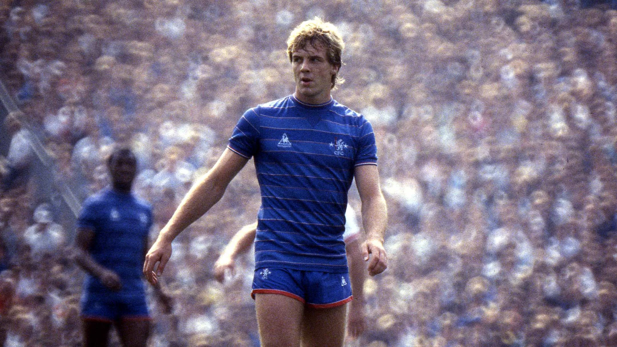
Chelsea’s identity as much of a fashion label as a football club has been shaped by a long run of memorable shirts. From faithful royal blue homes to experimental away strips, the club has frequently set the tone for English football’s kit design.
The gold-trimmed royal blue home shirt that followed the club’s first-ever Champions League title in 2011–12 is a high point. Replacing the usual white trims with gold and including an all-gold club badge, the 2012–13 look coincided with Chelsea lifting the Europa League and arrived in Eden Hazard’s debut season at Stamford Bridge.
Chelsea’s 1994–96 away kit proved that risk can endure. Its tangerine and graphite colour scheme was designed to avoid clashes but became a cult classic, underlining how unconventional choices can win lasting affection.
At the opposite end of the spectrum is a simple royal blue shirt featuring a round-neck collar and the traditional club badge. With no flashy sponsor logos or trims, it is a reminder that restraint can be timeless.
The post-2003 Abramovich era introduced a clean, modern all-royal blue design, set off only by a white V-neck collar and sleeve trim. That shirt is inseparable from Chelsea’s first Premier League title, won in 2004–05 while the club wore the design.
More recent creativity was on display with the 2024–25 third strip, an all-black kit rich with punk-rock motifs, a double Nike Swoosh celebrating the rise of the women’s game, and bright pink and yellow accents. It was worn during the club’s Conference League triumph and has already established itself as a contemporary favourite.
There are also pieces of kit heritage: Le Coq Sportif’s 1983–85 home strip with vertical stripes and red accents and a stripped-back crest; the 1974–75 away tribute to Hungary’s Magnificent Magyars, white with a central red and green stripe, a design revisited in the 2025–26 season; and the Commodore-sponsored late 1980s and early 1990s era, capped by the 1991–93 home shirt with a peak ’90s geometric pattern, thick collar and bold red-and-white trim.
Together these shirts show a club comfortable with both heritage and invention.
-

 Analytics & Stats2 months ago
Opta Supercomputer: Tight Premier League Relegation Picture After Tottenham Defeat
-

 Premier League2 months ago
Peter Bankes Stands By Decision to Void Kolo Muani Goal in Tottenham v Arsenal
-

 Man City2 months ago
Maguire: City Could Face 40–60-Point Deduction If FFP Breaches Are Proven


