Football Kits
Manchester United unveil 2026-27 third kit as final jersey of the set arrives
United have unveiled their 2026-27 third kit, completing the set for the new campaign.

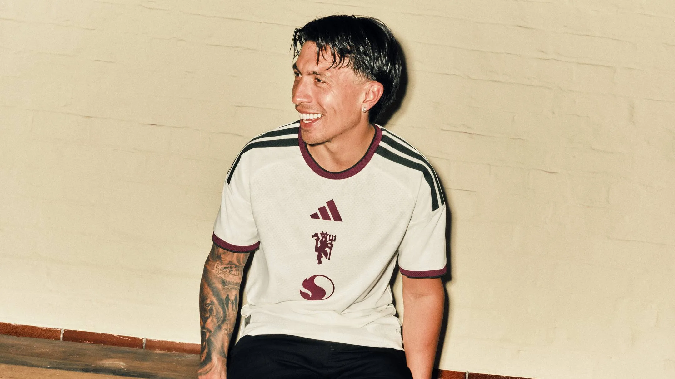
Manchester United have rounded off their 2026-27 kit launch by revealing the new third strip, completing the club’s full set for the campaign.
Built around an ivory base, the shirt carries three central logos. adidas sits high on the chest, while the devil has been placed in the usual position of the club crest. Snapdragon’s name has also been removed, with only the company logo shown.
The shirt is finished with a delicate floral pattern running across the fabric. According to the club, the design draws inspiration from several well-known pieces of art across Manchester. The launch video for the jersey was filmed at the Salford Lads and Girls Club.
The video also featured former club figures Gary Pallister and Peter Schmeichel, alongside Manchester locals Aitch and Angry Ginge.
Supporters can buy the new kit now through the club’s official stores and selected adidas outlets.
With the full range now public, attention turns away from the launch itself and towards Michael Carrick’s squad, who will hope the new strip becomes part of a successful season.
Twelve months ago, spirits were as low as they have ever been, but Carrick’s arrival in midseason changed the mood after a stunning second half of last season. He is now in charge on a permanent basis, though he has been careful not to overstate what lies ahead.
“I think you’ve got to have the belief, you’ve got to be going into the season thinking we can achieve something special,” Carrick told the Daily Mail . “Don’t be going into a season thinking this could be a struggle. We’ve got to set out to really achieve something.
“We’ve definitely got the potential to achieve something really special. I’m not hiding from the fact, and we should aim to do that.”







Football Kits
Premier League Home Shirts for 2026-27: A Full Ranking
All 20 Premier League home shirts for 2026-27 ranked, from failures to standout designs.

Every Premier League home shirt for the 2026-27 season has now been unveiled, and the range is as varied as ever. Some designs arrived before the campaign ended, while others have only just reached the market, but the full set is now in circulation.
There are genuine highlights among them, including three strong efforts from the newly promoted clubs. But there are also several releases that feel flat, awkward or simply poor. With that in mind, here is a complete ranking of all 20 home jerseys for 2026-27.
Bournemouth, despite a normally dependable Hummel relationship, land among the weakest offerings. Their red and black stripes are overwhelmed by an oversized circular sponsor, while gold around the neckline adds little. Newcastle United fare even worse, with an adidas design that recalls West Bromwich Albion’s infamous 2020-21 barcode kit and offers very little to admire.
Fulham and Everton sit in the lower reaches too. Fulham’s shirt is tidy but painfully plain, while Everton’s Castore effort is a near-repeat of the 2016-17 model and brings the same sense of sameness. Nottingham Forest’s jersey is hard to remember for the right reasons, and Leeds United at least experiment with a horizontal look, though the result is only partly successful.
Manchester City and Tottenham Hotspur both keep things restrained. City’s simple sky blue-to-white gradient is neat enough, and Spurs have returned to a basic white style with navy accents and a subtle diagonal pattern. Brentford earn credit for resisting waste and sticking to a two-season cycle, while Aston Villa’s claret and blue shirt is sharp, clean and effective.
Higher up the list, Crystal Palace’s white shirt with a red and blue sash offers a welcome nod to the past, Brighton & Hove Albion’s pinstripes stand out again, and the promoted clubs make a strong impression. Ipswich Town’s shirt uses a subtle diamond motif, Liverpool revisit an iconic adidas-inspired template, and Manchester United’s polo collar brings real polish. Hull City’s striped effort is also a major success, while Arsenal, Coventry City and Chelsea all finish strongly. Arsenal’s patterned cuffs and collar work well, Coventry’s textured stripes look elegant, and Chelsea’s blue base with yellow accents is a sharp final entry in the ranking.
Arsenal
Arsenal Restore Yellow For 2026-27 Third Kit
Arsenal have brought back yellow for their 2026-27 third kit, with ambition driving the new design.
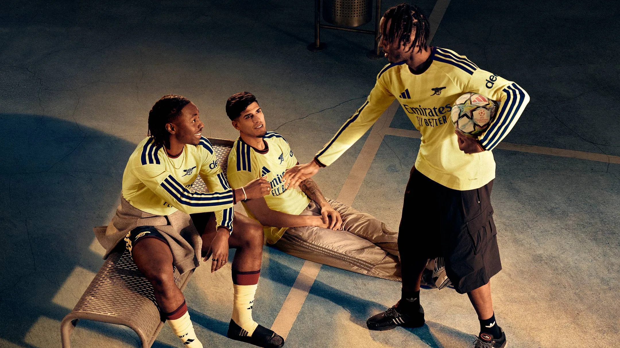
Arsenal have revived a familiar look for their 2026-27 third strip, bringing back yellow for the first time in five years.
The colour had not appeared on the pitch since 2021-22, when it was last used in match kit form. Since then, it has been kept largely for lifestyle collections, but it now returns for Mikel Arteta’s side as they prepare for the new campaign.
Released with the tagline “Arsenal State of Mind,” the design is built around the idea that the club is “more than a club” and instead “a shared sense of possibility.” That message fits the mood around Arsenal this season, with expectations high after last season’s Premier League title and a drive to add European success.
Alessia Russo spoke about what the kit represents from a player’s perspective. “Being part of Arsenal means being part of something bigger than yourself,” said Arsenal Women forward Alessia Russo. “There’s a sense of belief, ambition and togetherness that connects everyone who loves this club.
“That’s what Arsenal State of Mind means to me. It’s the feeling that we’re all part of the same journey and pushing towards the same goals. We can’t wait to wear this kit and create more amazing memories with our supporters this season.”
The third kit is completed with navy shorts and socks, and is now available through Arsenal and adidas.
The club’s ambitions do not stop there. Kai Havertz made clear that the target is to keep pushing after last season’s league triumph. “We want all the trophies,” he vowed. “That’s what we’re here for. We won the Premier League now but there’s a lot more that we can do.
“We have to reach another level to make that happen because we know how long the season is and how hard it is to go through all the competitions. We want to do it better again this year and make things happen again.”
He continued: “I think we can, or we have to go further. ”
Football Kits
Premier League kits ranked: the standout shirts of 2026-27
A fresh look at the best Premier League kits for 2026-27, from restrained classics to bold revivals.
The 2026-27 Premier League season, the 35th of the competition’s modern era, begins on Aug. 21, and the shirt reveals are already in full flow. With clubs moving early to show off their new looks, the latest batch of kits offers a wide spread of ideas, from restrained updates to more adventurous redesigns.
Chelsea’s away shirt returns to black, but the overall effect is limited by a design that feels undercooked. The gold laurel wreath detail around the round neck and sleeve cuffs carries over from the home kit, yet it does little to lift an otherwise plain release. Newcastle United, by contrast, have altered their famous stripes too heavily, moving away from the thick black-and-white bands that define their look. The oversized central stripe helps slightly, but the pale blue shoulder detailing leaves the shirt looking uneven.
Tottenham have kept their home kit clean and minimal, continuing the stripped-back direction Nike has used since 2017. Their away shirt is much more daring, built on a dark navy base with jagged purple, pink and orange bands intended to reflect cultural diversity and the energy of the club’s surroundings. Bournemouth’s home shirt is also sharp in theory, with black-and-red stripes and gold trim, but the oversized circular “Vitality” sponsor dominates it.
Some clubs have taken a more thoughtful route. Arsenal’s home kit marks the 20th anniversary of the move to Emirates Stadium, while Manchester United’s home shirt honours the 50th anniversary of the 1977 FA Cup final win. Liverpool’s home design revisits the famous “Candy” kit, and Manchester City’s new shirt uses a gradient from sky blue into white to reference the club’s history. Everton, Brentford, Nottingham Forest, Crystal Palace, Aston Villa, Hull City, Leeds and Ipswich Town all bring their own clear identities into the mix, with Brentford continuing their two-year kit cycle.
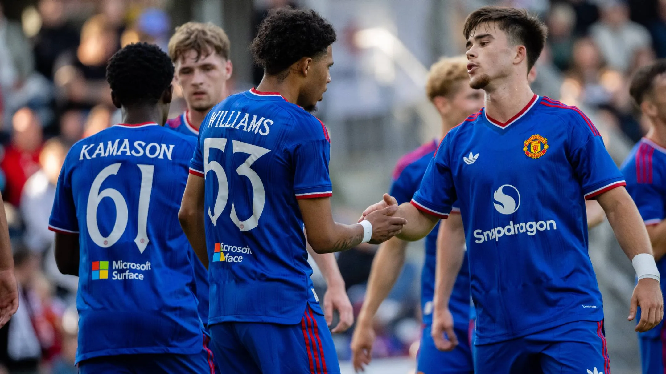
Among the strongest efforts, Leeds have delivered an away shirt built around a deep yellow base and an intricate “Yorkshire rose” pattern, while Crystal Palace’s sash return gives the away kit real character. Everton’s white away strip, with fine navy and yellow pinstripes, is unusual but effective. Ipswich’s home shirt adds subtle texture, and Hull City’s retro-inspired effort leans heavily on the club’s past. Manchester United’s royal blue away shirt also stands out as a confident return to a long-absent colour.